Tuesday, February 17, 2009
Sense n sensability machine . 1:50 AM
We had to search for a location in school of which to design a machine to experience that space, taking a sense while enhancing one or more other senses. Sense n sensability machine . 1:50 AM
After much considerations, my group and i decided to decrease the sense of sight while enhancing the sense of touch.
To do this, we made a pair of googles which had could fit more than one "lens". At one time there would be two lens in the googles made out of printed transparencies. On each transparency, is printed black grids and when they are placed in the googles the user may adjust them to how much he/ she wants to see. This is because when the square grids do not meet they block out more sight and when they do, they overlap each other leaving gaps for the user to look through.
To increase the sense of touch, we made this boxy- wooden- finger tip gloves mechanism. We made slots at the tip of these finger gloves and added acrylic strips four of which bended in differents ways to maximise touch-angles. To adjust and control these strips, we added in "strings" to the tip of these strips. We also designed wooden wing-like flaps to be attched to the back part of the mechanism so as to "sense" if there is anything located at the back of the user.
Monday, February 16, 2009
Slices | Live + Work + Show . 9:59 AM
Slices | Live + Work + Show . 9:59 AM
The designer i chose to work on is Santiago Calatrava, he is an architect, sculptor and engineer.
Mood box
#1 For the first mood box, i placed a slope made out of paper clay and attached a picture of the sky to the top of the moodbox to depict a peaceful and back to nature feel however, it was not very successful and the slope cracked and broke due to its material.
#2 As a lot of works by Santiago Calatrava seem to be inspired by nature and the bones of animals, the second moodbox had a ribcage.
Mock up model
From the moodbox came bone- like structures which led on to the 1:100 moodbox cum shophouse. These had a sort of kinestatic feel to them and were arranged in a form of an S.
The 1:100 mock up model evolved to the 1:50 model which was quite different from the previous model. This one had structures all over the place, uncontrolled and interesting to the eye.
Shophouse Drawings . 8:50 AM
We tried going to a street near Heeren but managed to find one or two that fit the criteria. However one of them was an office and the other a private residence. After ringing the doorbell for the office, no one opened the door for us. The door of the private residence was opened however the owner was not at home and thus we could not go in and measure the shophouse so with almost half the day spent there, we headed to Heeren to take a break. At Hereen, we decided to head to Chinatown to see if we could find any shophouse with a forecourt and two airwells there and so we did.
We took a bus there and when we arrived, the team split up in search for the shophouse with a forecourt and two airwells. Finally the shophouse with one forecourt and two airwells was found! It was also turned into an office. We were given the floor plans and told to make an appointment another day to measure the elevation but we did not manage to do so in the end as they were busy.
Before we knew that we couldnt measure the elevation, the workload were divided amongst ourselves to and the drawing of the floorplans commenced. Due to unforseen circumstances, we had to estimate the height of the shophouse to draw the shophouse and thanks to efficient management by our team i/cs and co-orperation on everyones' part, we could have quite a few sections, elevations and even an onthorgraphic projection on top of the basic requirements!
Wednesday, August 20, 2008
Labyrinth . 12:48 AM
Labyrinth . 12:48 AM

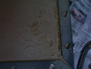
To cut this wood, a line gap was bore through the wood as the frame was quite tough to be removed and i used the tip of the blade of the handsaw as it was quite sharp but after some time the blade of the handsaw broke. The handle sprung out of shape so i could not fit in a new blade and this delayed quite a bit of time as i had to go buy a new one. With the new one, it could fit through the gap however after cutting for a while the same thing happened, the blade broke and the saw frame sprung out of shape and this delayed even more time. I decided not to use this very handsaw again but the machines at the workshop instead.


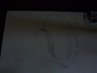

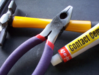

Tuesday, August 5, 2008
looks like.. . 7:35 AM
looks like.. . 7:35 AM
Since the running fridge post, ive been subsribed to Threadless newsletters via e-mail and guess what i saw on todays' e-mail....
 This totally looks like what we had done for the start of this term, onthography and according to threadless the Si Scott studio specializes in a unique blend of hand inked and penned design. yeap, i think it is.
 Sunday, August 3, 2008
. 11:04 AM
Monday, August 4, 2008. 11:04 AM
Went to Bras Besah quite a number of days ago to get materials for the model. We were told us to try sagacity. the price of the stuff there were quite stunning, cheaper than the prices we knew about but as i had not really sat down and thought about the model i dint really want to buy much materials just yet except for an aluminium sheet. That day, i had wanted to rush back to my secondary school to collect my graduation cert however had somehow boarded the "wrong train" and ended up late as the office closes at 4.30 and thus i bumped into my friend at toa payoh. She knew that i had to get materials and suggested that i go to the market to find some but i was carrying quite a lot of things so she kindly offered to go along with me. When we were about to reach the bus stop, we saw a heap of wood thrown outside a building. We got down and found even more wood which was nearer to the bus stop. We asked the people working there if we could take some and they were like "take take" the planks were huge but my friend kindly helped me alll the way to my house. Really blessed!
Monday, July 28, 2008
3d models . 8:37 AM
From the tesselations, we were suppose to pick a row from one of our 3 tesselations and make copies of the outlines. We were also required to aquire satay sticks and make 10 by 10 cm cubes out of them. 3d models . 8:37 AM
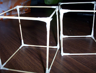
Thereafter we had to turn 3 of the 2d Tesselations into 3d. We had to cut out the shapes of the copies of the tesselations and 3dlise them in anyways that we would like into the cube as long as the whole facade looks like the one cube looks like the square of the 2d tesselation which we have cut out the 2d from. For me this took quite alot of time as i had to think parts by parts how i would want them to be and how it could come together as a whole. In fact it took me the whole night to complete just one.
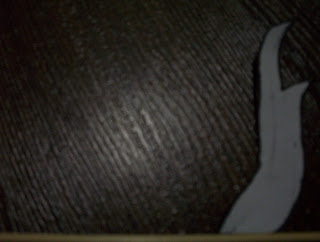
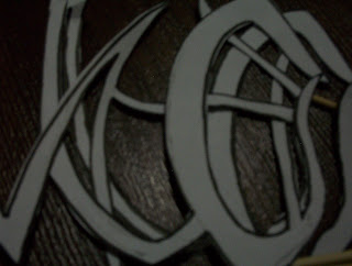
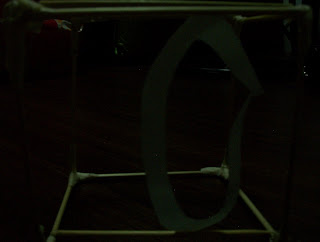
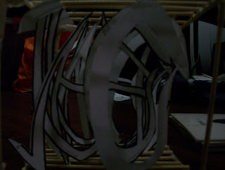
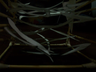
From the 3 cubes, we were to pick one and create the fourth one using ZO cards. This fourth one would have to be in ways usable by humans. To do this, we had to imagine little people being able to move through the model and use it. Turning parts of the planes into walkways, tables, chairs, walls and the like.


